Essentials Events
Display upcoming events and corporate calendars with eight versatile layout options.
Configuration Guide
To configure the Essentials Events webpart, edit your page, select the webpart, and open the properties pane on the right.
Title & Calendars
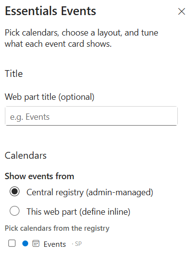
Set up your webpart heading and choose where event data originates:
- Web part title (optional) — Specify a heading to show above the events feed (e.g., Events).
- Show events from Central registry (admin-managed) — Source events from tenant-level or central registry calendars. Select specific calendars under "Pick calendars from the registry" (e.g., Events · SP).
- Show events from This web part (define inline) — Add and manage custom event entries directly within the webpart interface on the page.
Layout Options
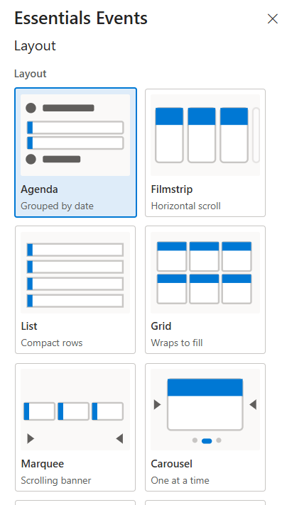
Select from eight unique presentation styles to best match your page design:
- Agenda — Clean list grouped chronologically by date.
- Filmstrip — Horizontal scrolling row of event cards.
- List — Compact, space-efficient horizontal rows.
- Grid — Multi-row, multi-column layout that wraps to fill available width.
- Marquee — Smooth, continuously scrolling banner display.
- Carousel — Interactive slide view featuring one event card at a time with page indicators.
- Feature — Featured "Hero" event highlighted prominently alongside smaller sibling event cards.
- Masonry — Staggered grid layout adjusting dynamically to variable card heights.
Display Settings
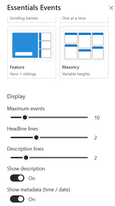
Fine-tune event counts, text truncation, and visible card fields:
- Maximum events — Set the total maximum number of events displayed using the slider (e.g., 10).
- Headline lines — Set the max number of lines for event titles before truncating (e.g., 2).
- Description lines — Set the max number of lines for event body summaries before truncating (e.g., 2).
- Show description — Toggle On/Off to show or hide the event summary text.
- Show metadata (time / date) — Toggle On/Off to display event dates and times on the card.
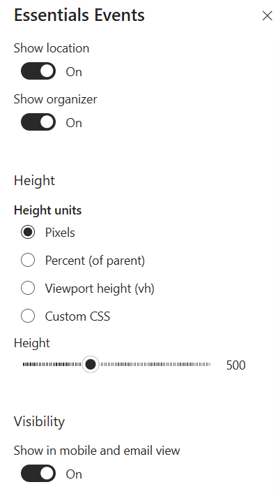
- Show location — Toggle On/Off to display meeting rooms or venue locations.
- Show organizer — Toggle On/Off to show the event host/creator profile details.
Height Settings
Customize how the webpart container scales vertically:
- Height units — Select the dimensional measurement method:
- Pixels — Fixed height in standard pixels.
- Percent (of parent) — Dynamic percentage height relative to the parent SharePoint column/container.
- Viewport height (vh) — Responsive sizing based on a percentage of the browser window height.
- Custom CSS — Apply custom styling parameters.
- Height — Drag the slider to adjust the container height value (e.g., 500).
Visibility
Manage client and mobile rendering options:
- Show in mobile and email view — Toggle On/Off to display or hide the events section when viewed on mobile devices or within email digests.
Key Features Configuration
| Feature | Description | Configuration |
|---|---|---|
| Title & calendars | Webpart heading and event data source | Web part title, central registry calendars, or inline entries |
| Layout | Presentation style for the events feed | Agenda, Filmstrip, List, Grid, Marquee, Carousel, Feature, Masonry |
| Maximum events | Total number of events displayed | Slider (e.g., 10) |
| Headline lines | Max lines for event titles before truncating | Slider (e.g., 2) |
| Description lines | Max lines for event body summaries | Slider (e.g., 2) |
| Card fields | Visible event information on cards | Description, metadata, location, organizer toggles |
| Height units | Vertical scaling method | Pixels, percent of parent, viewport height (vh), custom CSS |
| Mobile & email view | Events visibility on mobile devices and email digests | Toggle On/Off |
Property Pane Options
| Option | Type | Description |
|---|---|---|
| Web part title | Text | Optional heading above the events feed |
| Source | Radio | Central registry (admin-managed) or this web part (define inline) |
| Calendars | Multi-select | Pick specific calendars from the registry |
| Layout | Dropdown | Agenda, Filmstrip, List, Grid, Marquee, Carousel, Feature, Masonry |
| Maximum events | Slider | Max number of events displayed (e.g., 10) |
| Headline lines | Slider | Max title lines before truncating |
| Description lines | Slider | Max summary lines before truncating |
| Show description | Toggle | Show or hide event summary text |
| Show metadata (time / date) | Toggle | Display event dates and times on the card |
| Show location | Toggle | Display meeting rooms or venue locations |
| Show organizer | Toggle | Show the event host/creator profile details |
| Height units | Dropdown | Pixels, percent of parent, viewport height (vh), custom CSS |
| Height | Slider | Container height value (e.g., 500) |
| Show in mobile and email view | Toggle | Display or hide the events section on mobile devices and email digests |
Illustration