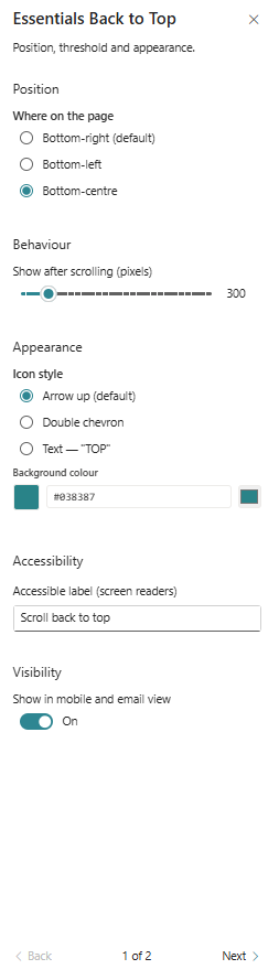
Essentials Back to Top
Provide a configurable button that appears after scrolling and returns users to the top of the page.
Configuration Guide
- Add the web part to the page where the return-to-top action should appear.
- Choose the button position: Bottom-right, Bottom-left, or Bottom-centre.
- Set the scroll threshold in pixels for when the button becomes visible.
- Select the icon style: Arrow up, Double chevron, or Text "TOP".
- Choose a background colour and confirm the accessible label used for screen readers.
- Toggle visibility for mobile and email view as needed.
Key Features Configuration
| Feature | Description | Configuration |
|---|---|---|
| Position | Where the button appears on screen | Bottom-right, Bottom-left, Bottom-centre |
| Visibility threshold | How far user scrolls before the button shows | Pixels scrolled before display |
| Icon style | Visual style of the button icon | Arrow up, Double chevron, Text "TOP" |
| Background colour | Background fill of the button | Colour picker input |
| Accessibility label | Text read aloud by screen readers | Screen reader label text |
| Mobile/email visibility | Control display on small screens and emails | Toggle on/off |
Property Pane Options
| Option | Type | Description |
|---|---|---|
| Position | Radio | Choose where the button appears on the page |
| Show after scrolling (px) | Slider / Number | Pixel threshold to show the button |
| Icon style | Radio | Select the visual style of the button icon |
| Background colour | Colour picker | Set the button background colour |
| Accessible label | Text | Provide a label for screen readers |
| Show in mobile and email view | Toggle | Enable or disable display on mobile/email |
Illustration